Projects
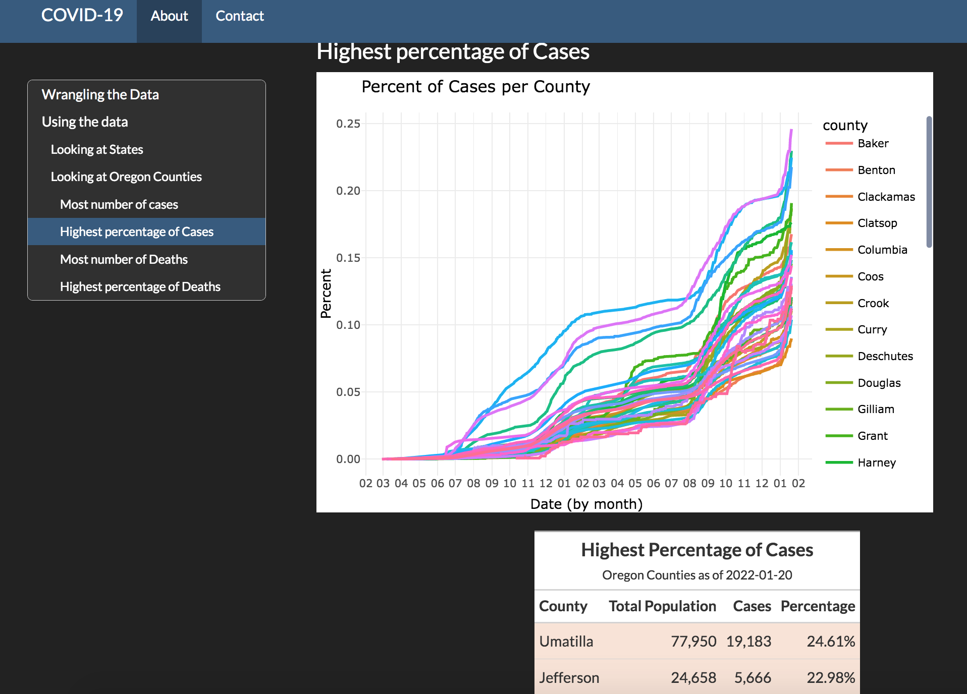
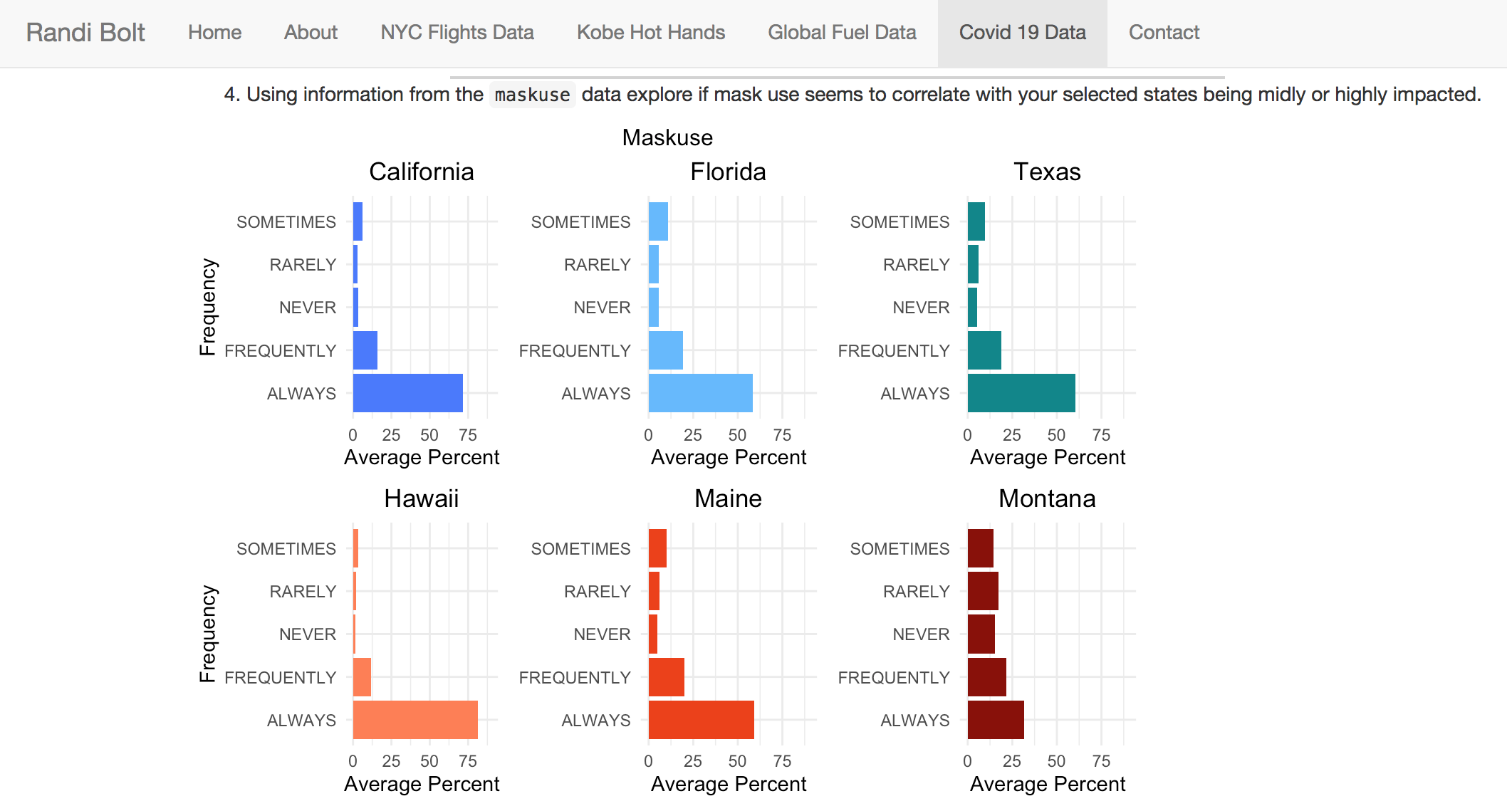
COVID-19
Manipulated 6 different data sets from the New York Times github repository with tidyverse packages in R to create data visualizations on Covid-19 in America and counties in Oregon. Presented via github repositories, and updated regularly.
magrittr
dplyr
readr
tidyr
lubridate
pander
ggplot2
gt
kableExtra
gridExtra
tidycensus
data manipulation
covid-19
plotly
Rsite
Created using github repositories, rsite includes 4 different class projects from Statistics-363 : Introduction to R. Each project includes various techniques of data manipulation, statistics, analysis, and visuals in the form of various tables, graphs, and a map.
NYC Flight data
Kobe Bryant LA 2009 NBA Finals data
Global Fuel data
Covid-19 data
magrittr
dylyr
pander
tidyr
gt
tidyverse
ggplot2
ggthemes
maps
lubridate
mean
quantile
conditional probabilities
base R
Rsite2
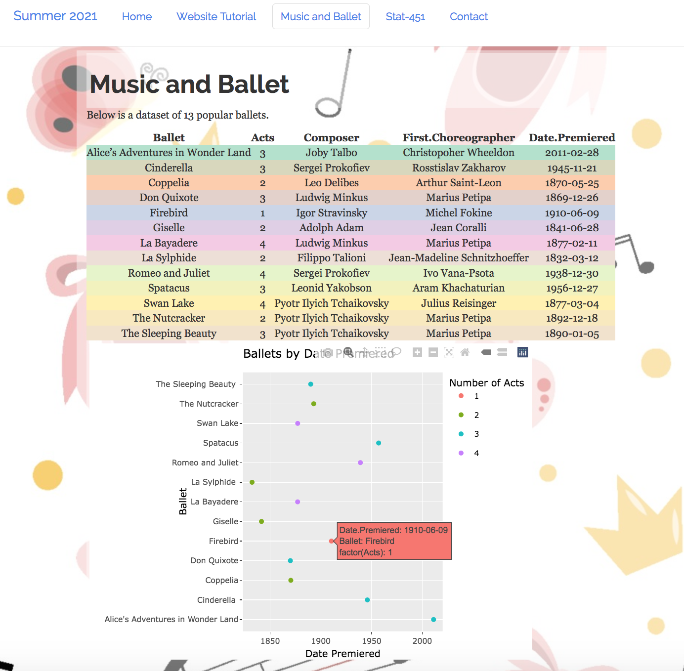
Inspired by Rsite, this site was created using R Studio, github repositories, and a little CSS. Included are instructions on how the project was created, data and visuals on classical ballet, and one of my statistics homeworks done compeltely in R.
R
github
CSS
ggplot2
stem
hist
mean
median
sort
sum
length
sd
sqrt
quantile
min
max
par
boxplot